5 Decor Formulas, Courtesy of Joanna Gaines
#TricksOfTheTrade
5 ‘Fixer Upper’ Decor Formulas That Are So Easy to Re-create
There are few things more rewarding than decorating a new remodeled room. Whether it’s something as minor as hanging new pictures in a freshly painted entry or finding the perfect paper towel holder for your fully renovated kitchen, the excitement of the task is difficult to go unnoticed.
Sometimes though, the vision you have in your head doesn’t pan out exactly how you imagined it. That beautiful floor to ceiling mirror you bought for the corner doesn’t make the room look larger – in face it clutters the space! Talk about a let down.
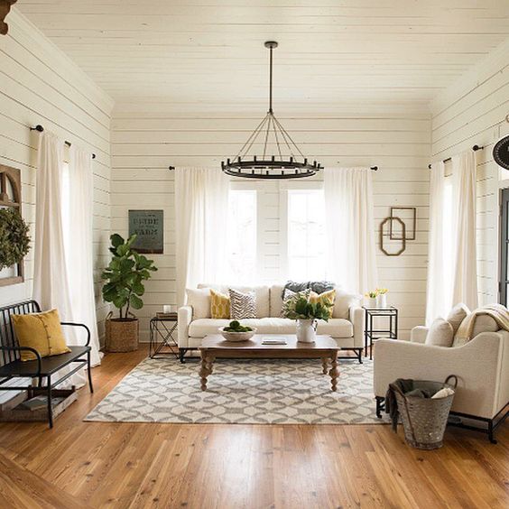
In an effort to circumvent the disappointment, I like to look for tips from professional designers to get an idea of some of the practices they use in the “subject space” to help the room live up to its full potential. Today while researching some ideas on how to combine a formal dining and living room with some level of fluidity, I came across this great article by PureWow. In the article, they break down 5 awesome go-to’s that the Queen of Fixer Upper uses when decorating. To see the original article, click here. Otherwise, continue below to check it out! 🙂
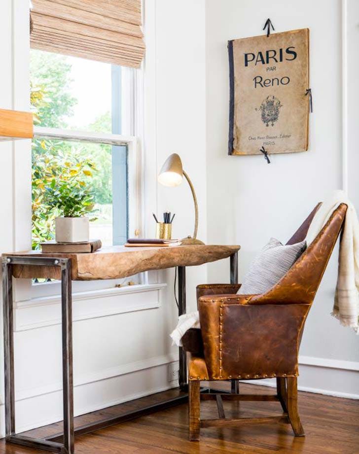
WINDOW + WRITING DESK + WING CHAIR = STUDY
Not every floor plan can stomach a private office—but that’s no excuse to skip a work station altogether. Here, she faked one in a sunny corner using a shallow, live-edge desk and a cozy leather lounge chair pushed up against a window. Sigh.
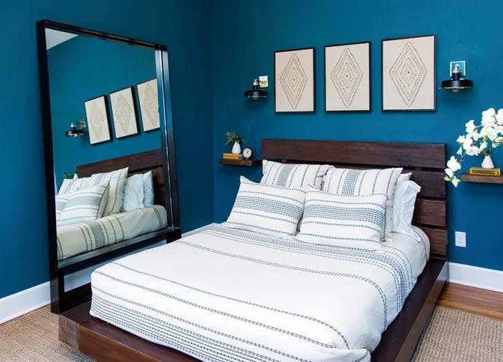
MIRROR + FLOATING TABLES + SCONCES = BIG(GER) BEDROOM
In this teeny bedroom, a giant mirror gives the illusion of an airy passageway, while shallow, wall-mounted ledges and lighting free up plenty of floor space. The result? A compact—but not at all claustrophobic—boudoir.
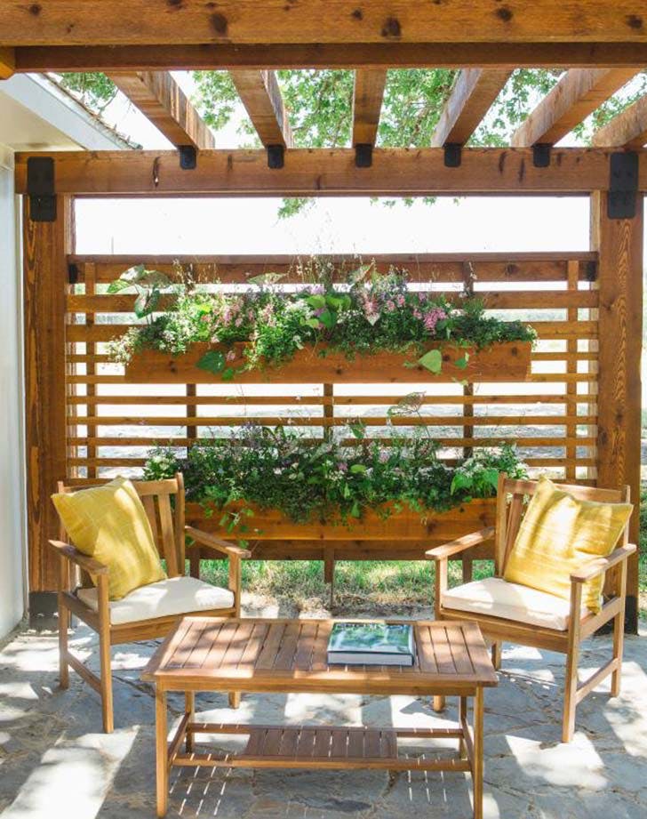
CHAIRS + TRELLIS + FLOWER BOXES = ALFRESCO LIVING ROOM
Getting scale right in an outdoor space is tricky. We love how Jo created a “room” here by stacking XL window boxes against a “wall” of woodwork and pairing with a set of easy chairs and coffee table.
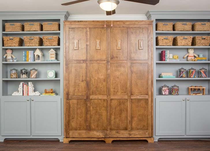
BOOKSHELF + BASKETS + CANISTERS = PLAYROOM
To mimic this pretty playroom, turn a bookshelf into toy storage central command. Leave the cutest toys out on display as decorative objects, organize craft supplies in canisters, and tuck anything unsightly in uniform baskets on the top shelves. (Bonus points for a macaron box paint job.)
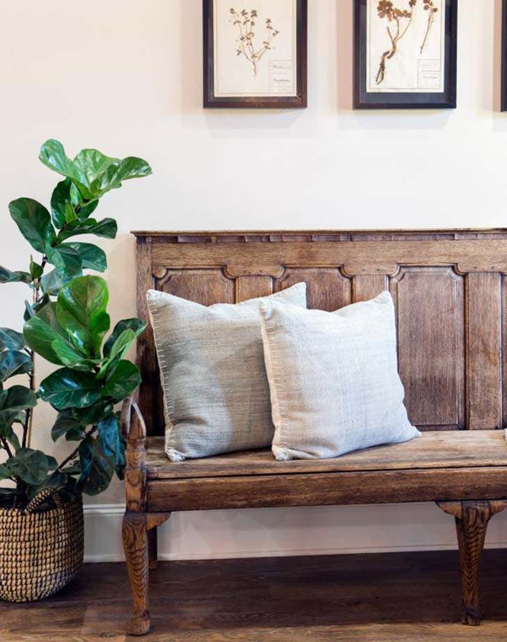
BENCH + PLANT + ARTWORK = FOYER
Less is more when it comes to entryway styling, and here, Jo opted for a high-backed, church pew bench (perfect for tying shoes or tossing your handbag), an oversize fiddle leaf fig tree and serene botanical print artwork. Anyone else feeling inspired to toss their cluttered coat pegs?
